Resume
Professional Experience
Web UX/UI Developer
Journal Technologies, Inc. (fka Sustain Technologies)
March 2014 to present
- Spearheaded development of the company’s first React Native application, which communicates with Bluetooth beacons to detect proximity
- Collaborated with the documentation department in developing a new iteration of the company’s public website
- Created and maintained some of the company’s various cloud-based SaaS web applications
- Updated features for the company’s web-based Case Management Software, focusing on user experience and responsive design while maintaining compatibility with legacy browsers
- Created prototypes and corresponding documentation on new features, and integrating these to the aforementioned application
- Assisted the Quality Assurance team in delegating development issues, and in verifying development fixes
Front-End Developer
EventSorbet, Inc.
June 2013 to July 2014
- Created mockups and graphic assets for the company’s website, blog, newsletters, and social networking pages
- Implemented the aforementioned designs to HTML/CSS
- Oversaw the design of the company’s marketing materials
Web/Mobile App Designer
Freelance
April 2013 to March 2014
- Created mockups and visual designs of websites, mobile applications, and print materials for various clients
User Experience/Interface Designer
Evolutionate, Inc.
August 2011 to April 2013
- Created detailed flowcharts, mockups/wireframes, and functional specifications of 14 different mobile applications
- Prepared periodic Quality Assurance reports for 18 mobile applications
- Conceptualized and created iOS and Android graphic assets for 7 mobile applications
- At least 10 of these mobile applications are currently live in the Apple App Store/Google Play, while the rest are still under development
Skills
Languages/Frameworks/Libraries Used
- HTML (including HTML 5)
- CSS (including CSS 3 and SCSS)
- JavaScript and jQuery
- React
- React Native
- Ruby
- Ruby on Rails
- Bootstrap/Foundation
Software Used
- Docker
- Estimote
- GitHub
- JetBrians (IntelliJ, RubyMine, DataGrip)
- NPM/Yarn
Graphic Design & Documentation
- Adobe Photoshop
- Adobe Illustrator
- Balsamiq Mockups
- Microsoft Office
- iWork
- Confluence/JIRA
Other Skills
- Great problem solving, quantitative, and analytical skills
- Able to multi-task while being efficient
- Willingness to learn new technologies
- A team player and a hard worker
- Excellent verbal & written communication skills
- Bilingual in English and Tagalog/Filipino
Education
Ateneo de Manila University
Quezon City, Philippines
Graduated March 2011
Bachelor of Science in Applied Mathematics (Honors)Major in Computational Science, Minor in Interactive Multimedia
Portfolio: Web Design
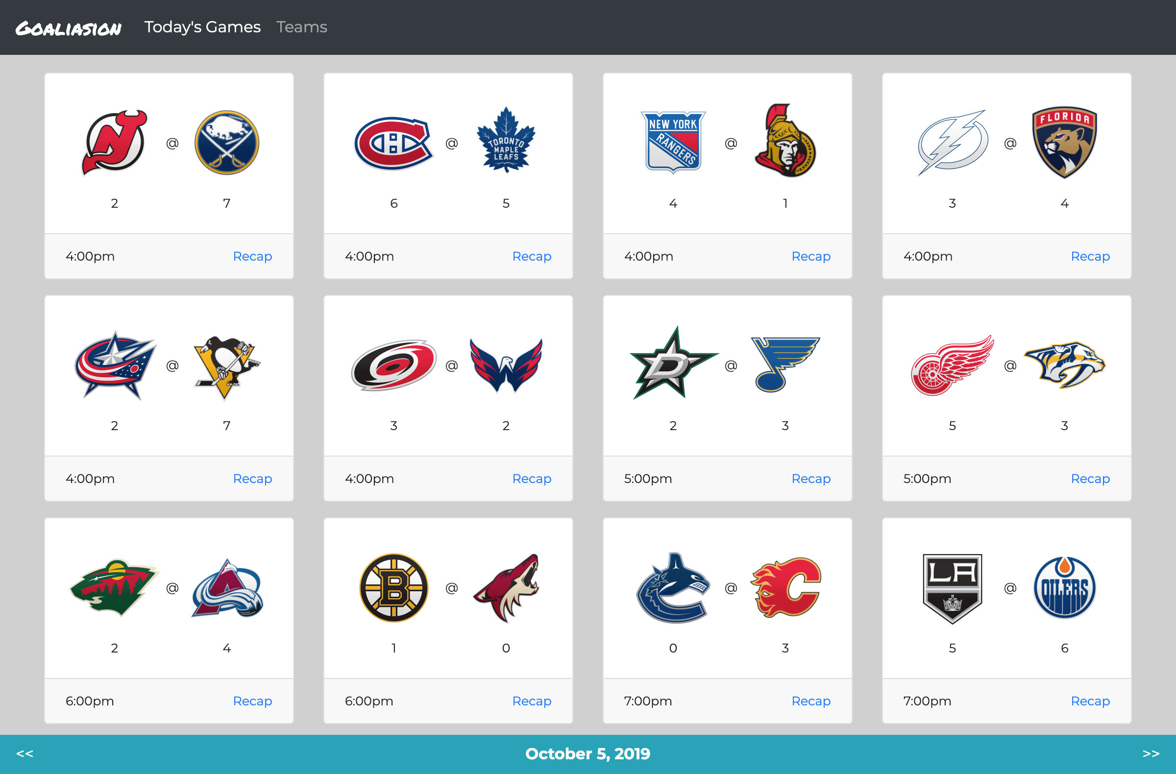
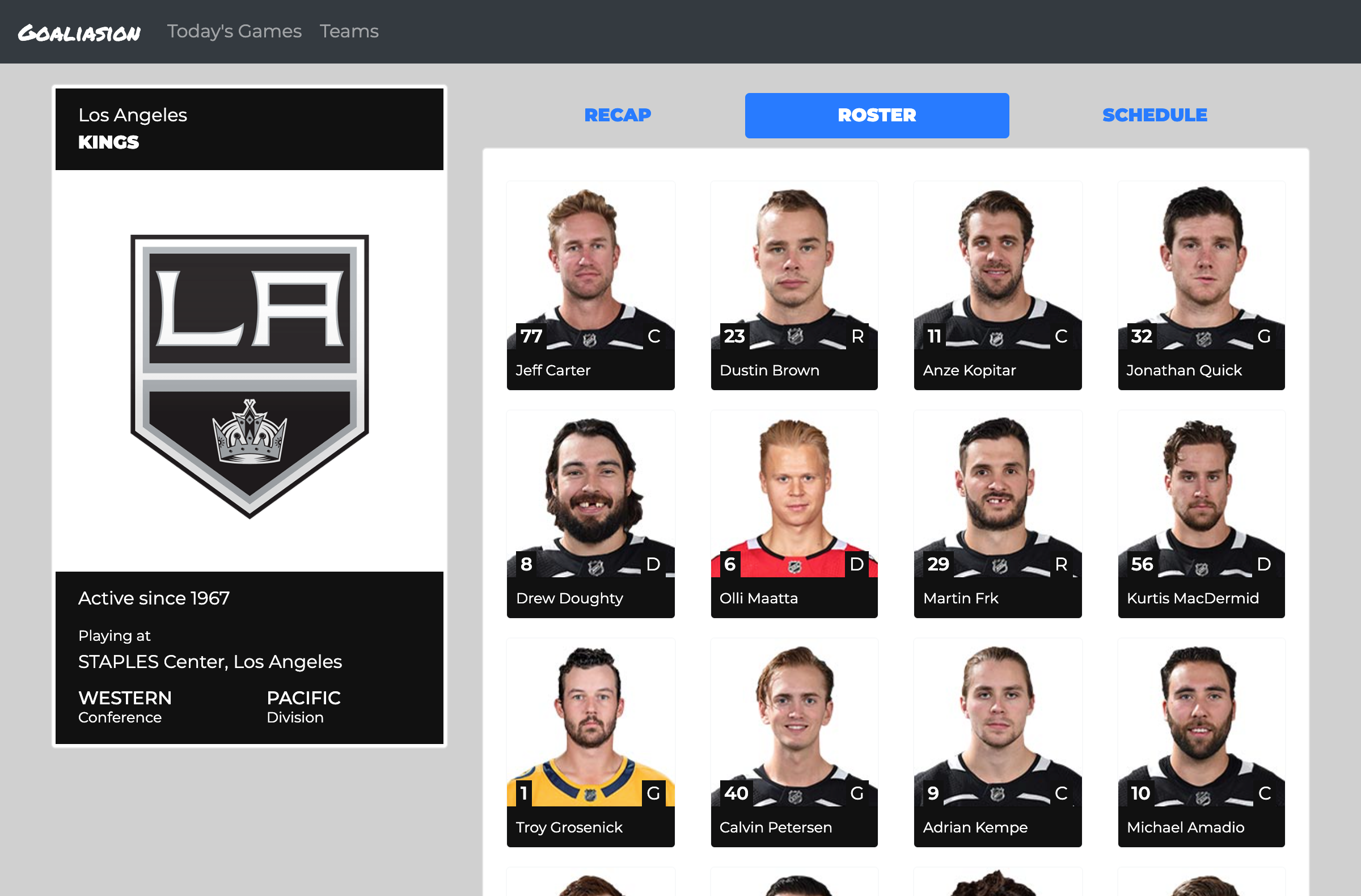
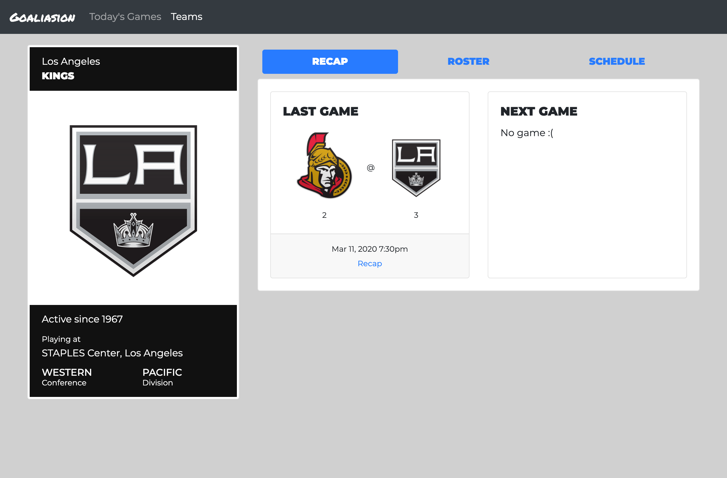
This website is a personal project that allows me to combine two of my passions: front-end development and hockey. It converts data from the National Hockey League's API into a user-friendly interface. It was created using React and Bootstrap 4, and is hosted through GitHub pages. Since the data is coming from an external website, and there's no user data stored, there is no back-end.
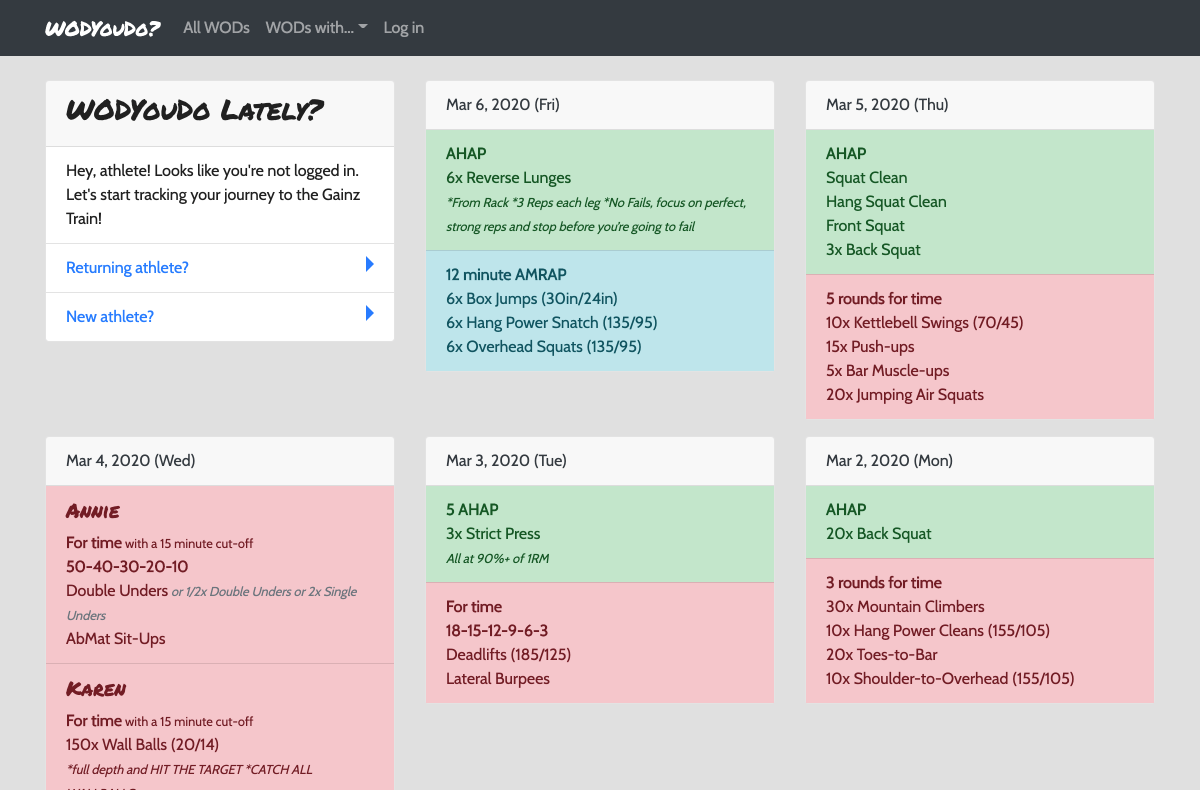
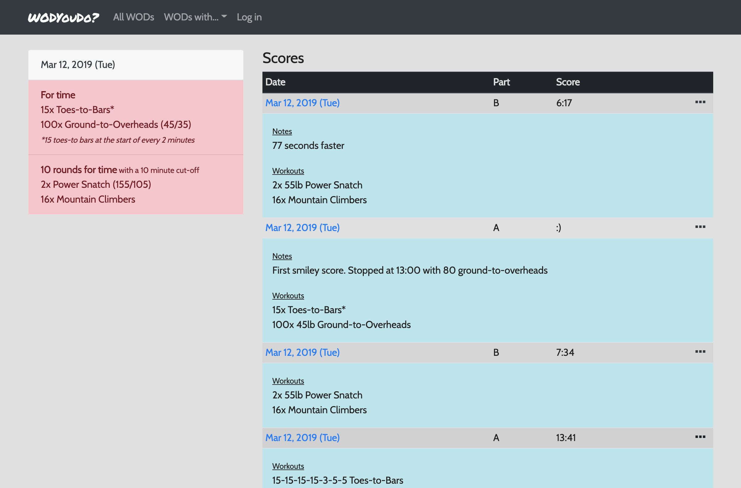
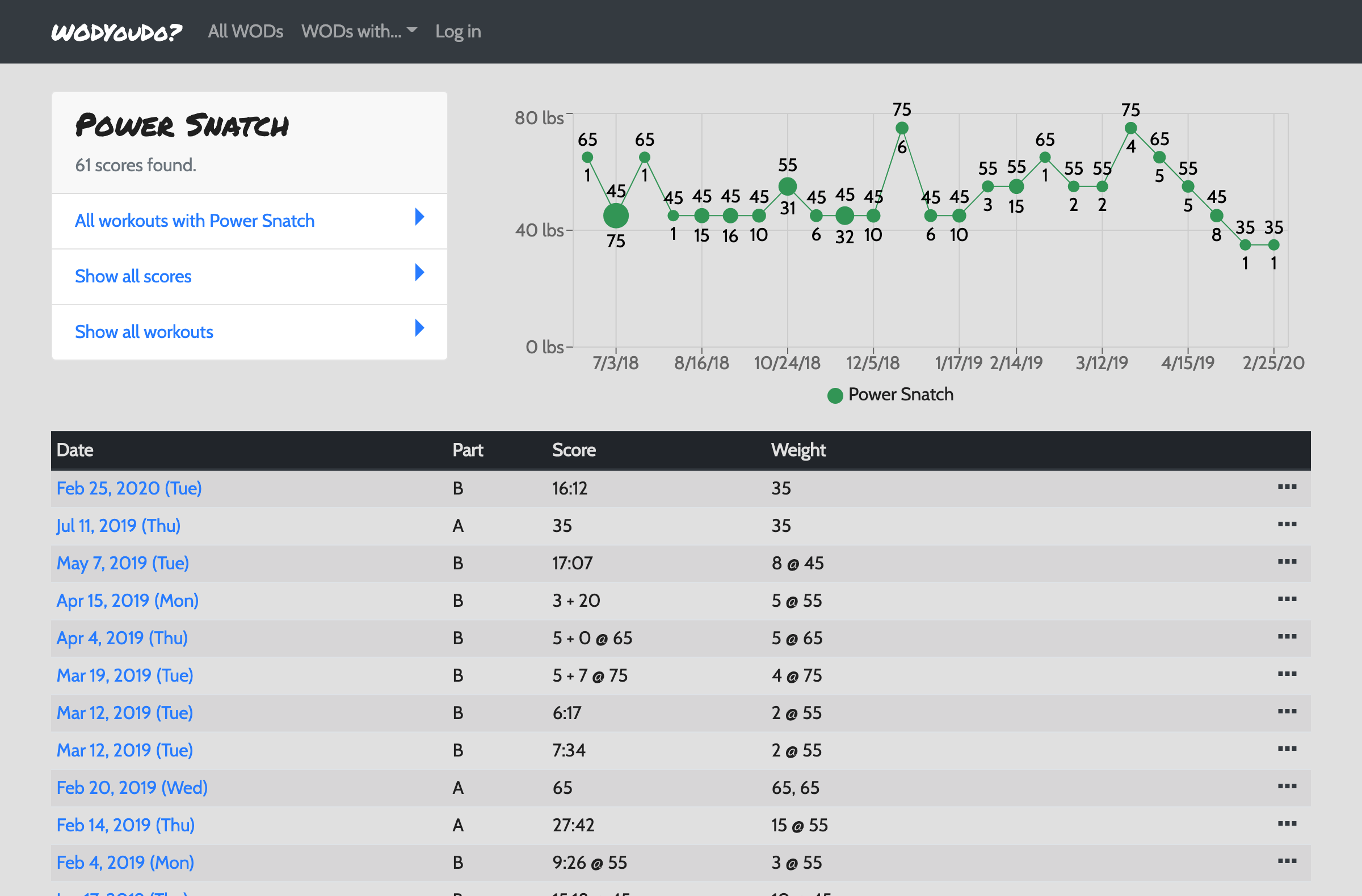
WODYouDo was created to document my personal CrossFit progress.
The homepage shows today's workout of the day (or WOD), if there is one. Otherwise, the latest WODs are shown. That list can be filtered to show only WODs with a specific workout.
After every workout, my score and notes for it are recorded on the WOD's page. From there, scores for a specific workout may be visualized (using both a graph and a table), denoting progress.
The front-end was created using React and Bootstrap 4, while the back-end was created using Ruby. Both the website and it's database are hosted through Heroku.
EventSorbet for Consumers
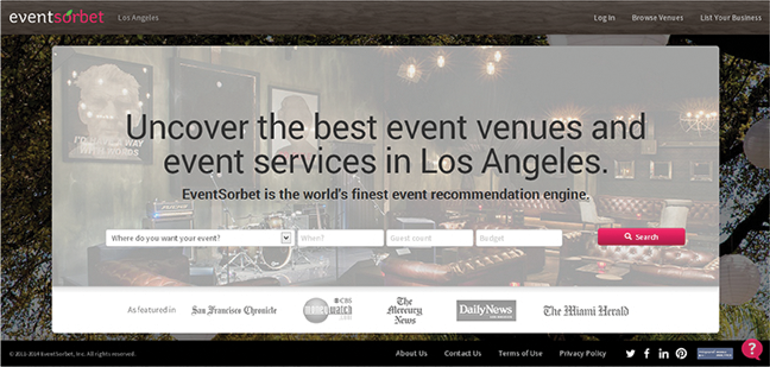
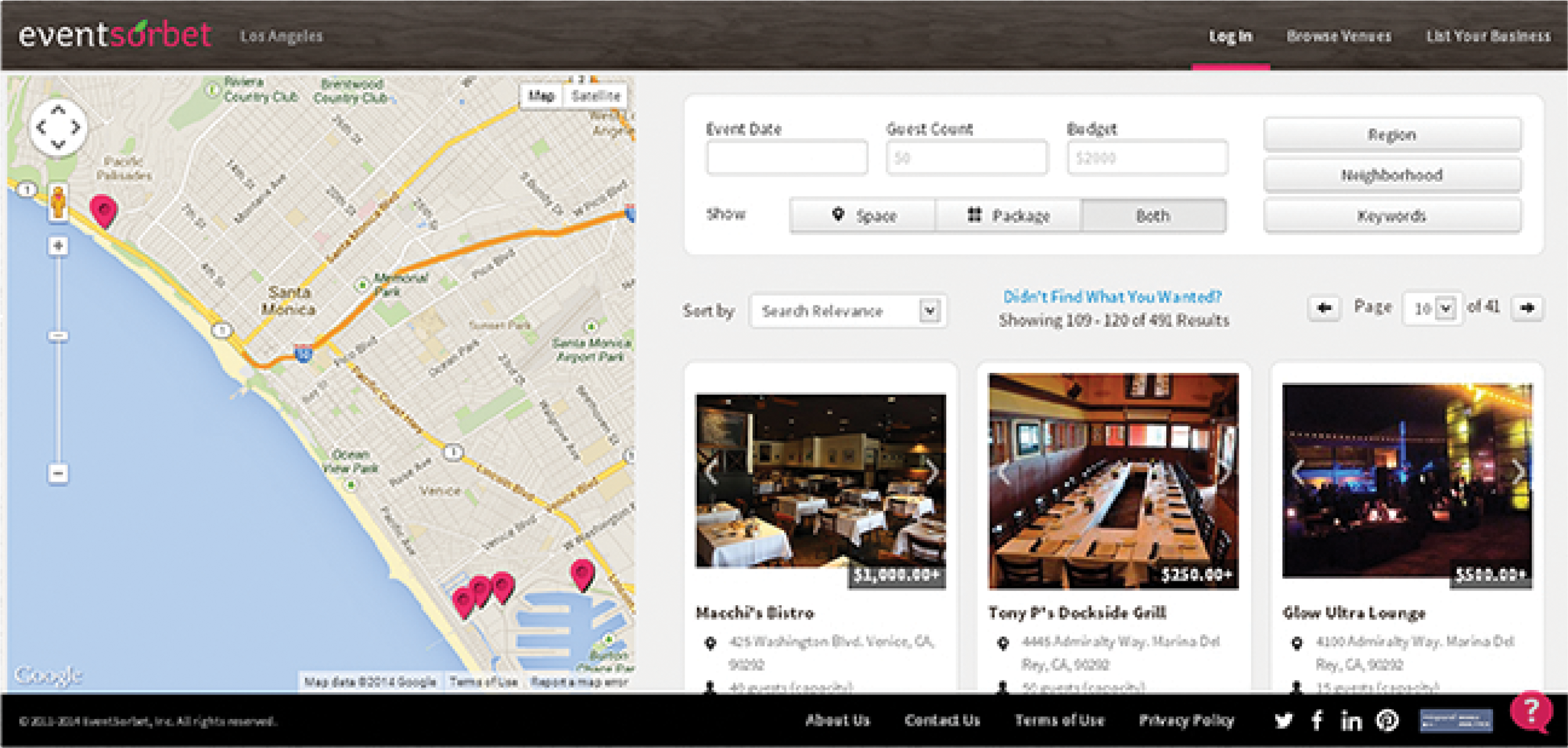
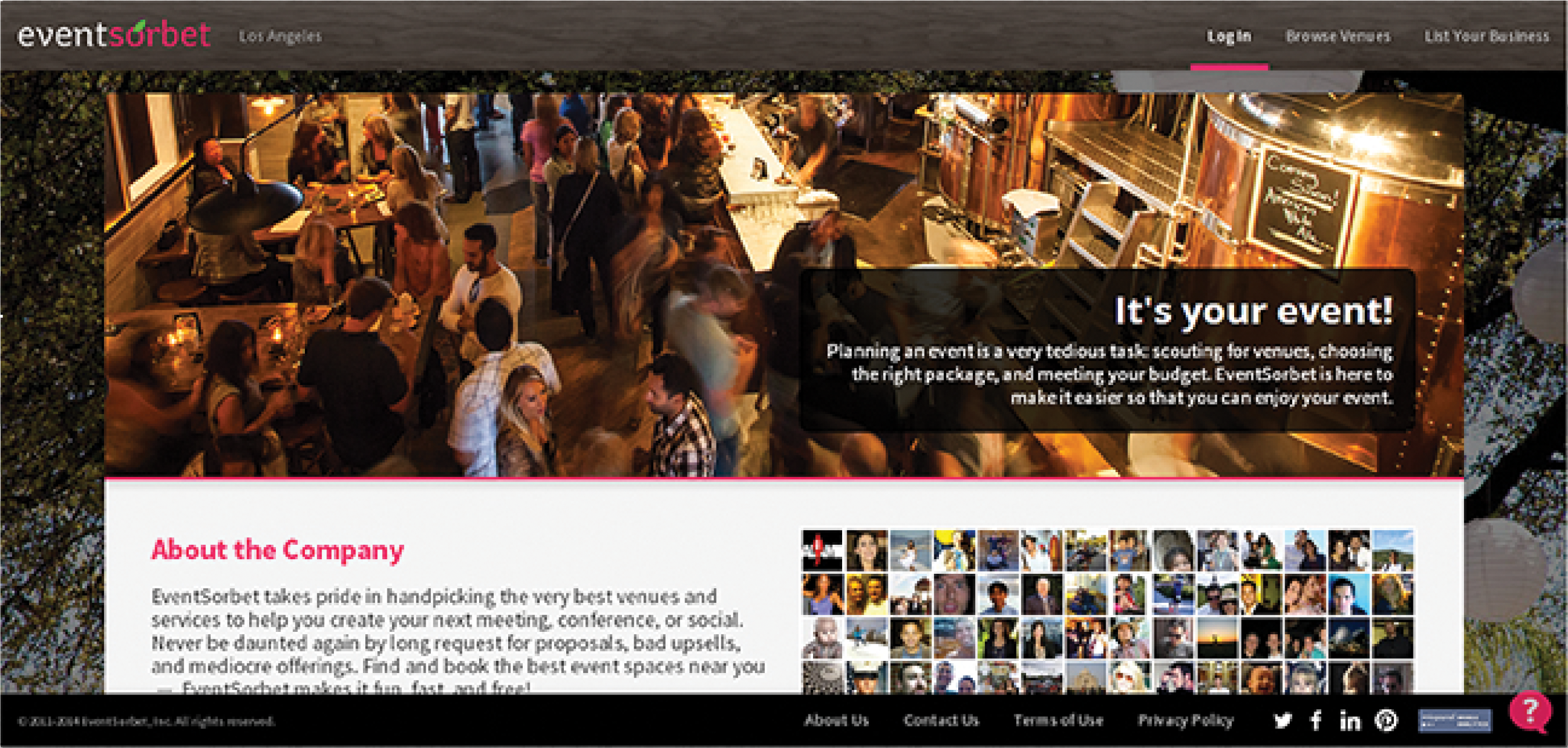
The whole website was created using Bootstrap v2.3.2, and was customized to meet the company’s needs, such as pink being the primary color. Both the background and the top menu uses tree-based designs for two reasons: images of nature soothes the already stressed-out visitor, and it blends well with pink.
The usual visitor is an regular person who has to plan a special party, and they get a lot of pressure and stress from it. To lighten their load, the landing page directly asks about the party’s most basic details, namely: occasion, date, guest count, and budget.
The second page has three sections: map, search criteria/filters, and search results. Location is a very critical factor in event planning. The map helps in narrowing down results. Another critical factor is aesthetics, which is addressed by adding a manual slideshow for each result. This reduces the need to open new windows for each result. Price is the next critical factor, which is why it’s placed at the bottom of the slideshow. If they like both the images and the price, they’ll want to know about the establishment’s details, together with a link that selects it.
At this point, the user has already provided filters. The filters section of this page seems like the secondary function of this page, and is denoted by the grayscale colors of this section. This pulls focus away from it and into the images/results.
The About page is prefaced with a quick message for the user. It describes the challenges faced by the user, establishing a connection, followed by assuring them that the site is there to help them.
Both images on this page consists of groups of people. The top image denotes that the site can help in planning a party just like that, appeasing the user’s fears. The bottom image is a collage of Facebook users who like the site. This conveys that regular people are satisfied by the site’s services, appeasing more doubts.
EventSorbet for Clients
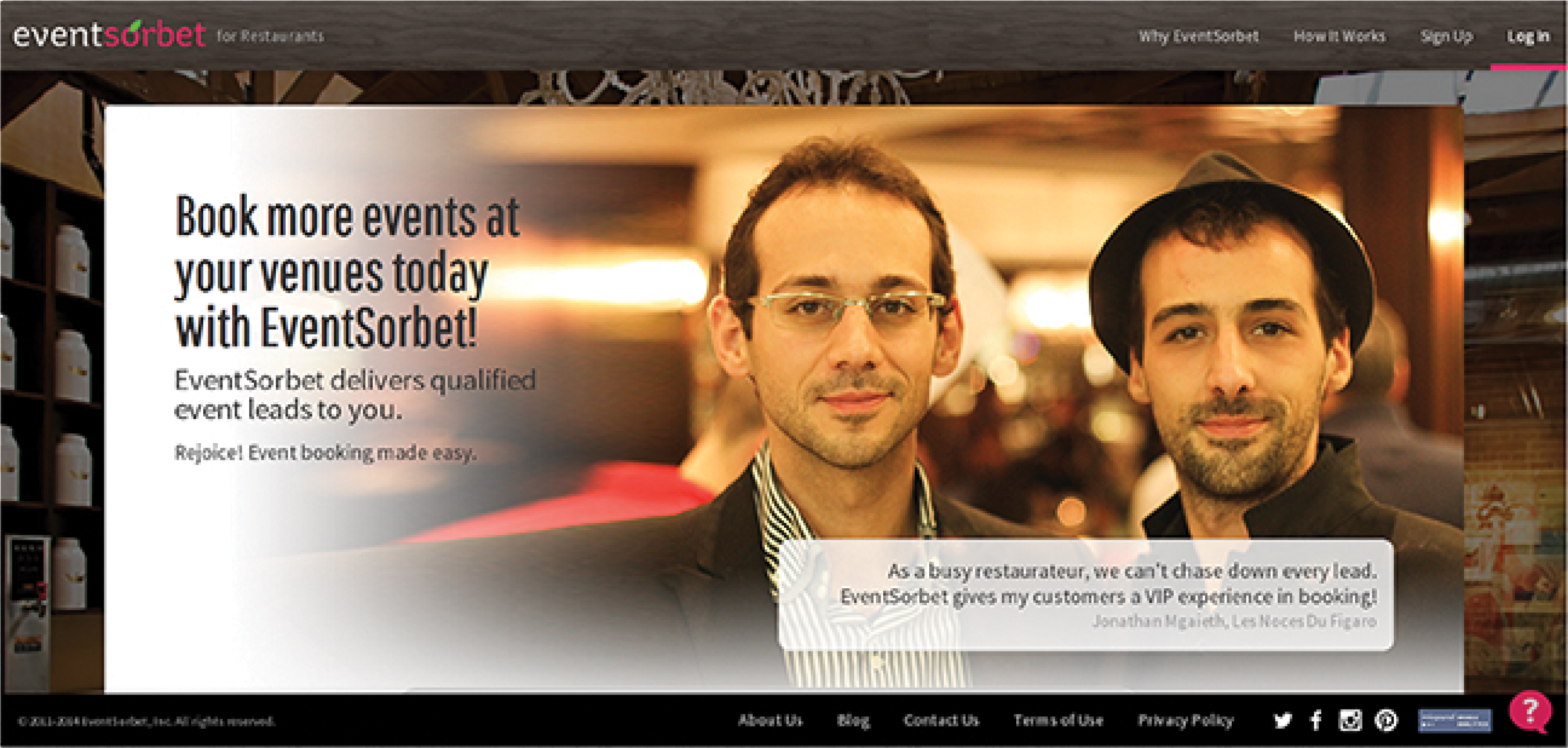
Unlike the consumer site, the client’s landing page consists of a quick blurb about the company, followed by a client testimonial. The accompanying image helps in backing it up. As the client scrolls down, they get to know the site’s purpose. This is presented in an image-oriented way, because a picture is worth a thousand words, and these thousand words help get the message across without sacrificing their time.
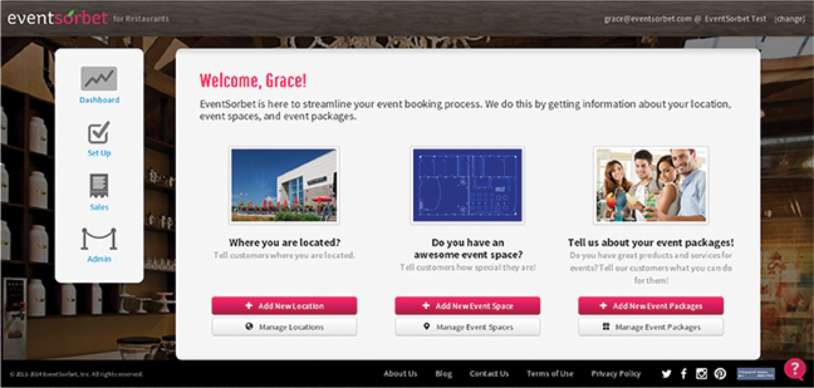
Other sections of the client site follow the aforementioned image-oriented approach, giving the client less time to read, and more time to use the site. The icons on the left side links to the site’s different secondary sections.
After the client logs in, shortcuts to various management sections show up, as these link to the main purpose of the site. If the client is new, the Add buttons become the primary buttons, since they have to add something before managing it. Otherwise, the Manage buttons are the primary buttons.
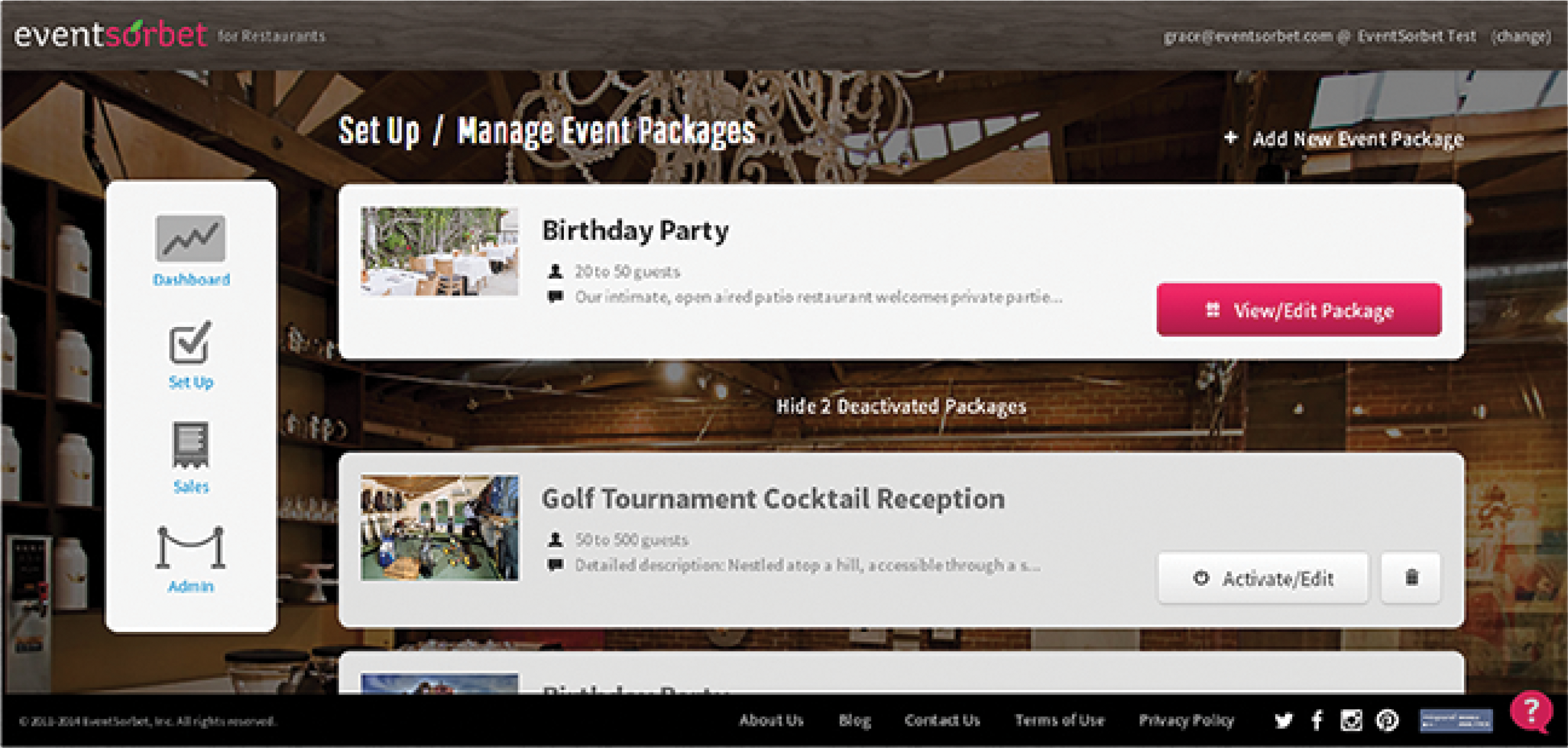
As mentioned in the previous page, once the client adds an item, this function becomes secondary. This is applied to the Add link located on the top right section. The main purpose of this page is to let the client view or edit an item, hence the corresponding pink buttons. Inactive items are listed after the active items. The link between them allows the client to collapse/expand the inactive list. Items being inactive causes its priority to go down. To convey this, the generic white button is used, instead of the pink primary ones.
Portfolio: Mobile Design
Location App Sample
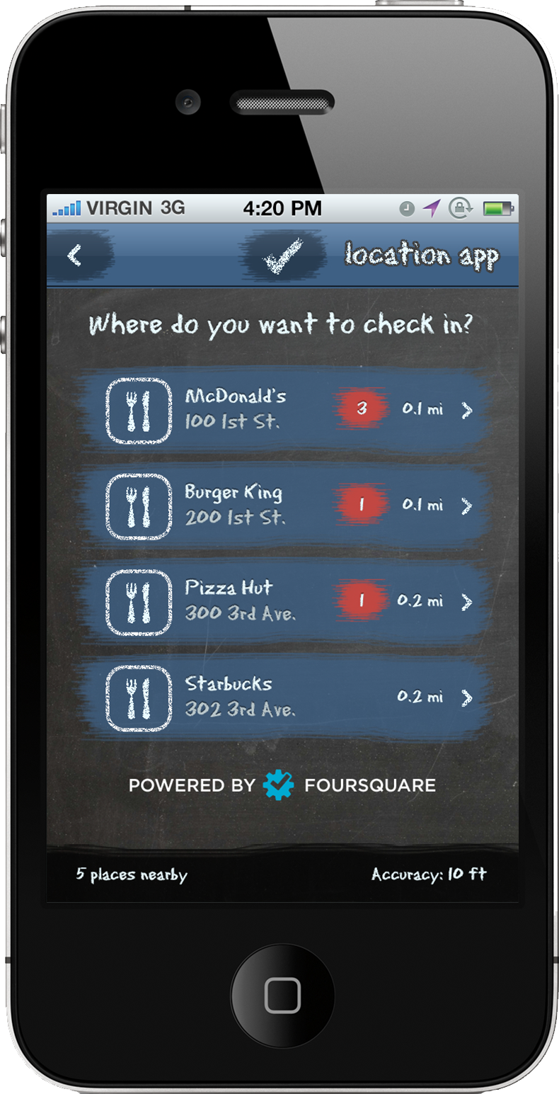 Nearby Locations
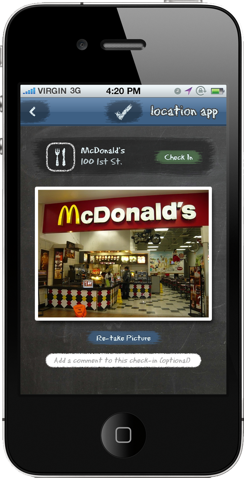 Location Information
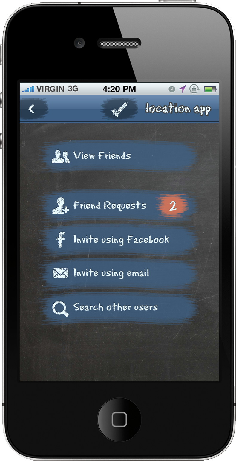 App Settings
Similar to Swarm (fka FourSquare), this app allows people to check-in to places around them. The theme is based on hopscotch, as both involve moving from place to place. To pull it off, both buttons and text look like it is marked using chalk, while the background is a blackboard.
The shade of blue featured is the same as Facebook’s. This evokes a feeling that you’re using an app similar to it, as both apps have a social element.
For primary action buttons, common chalk colors that aren’t blue are used. The red chalk marks with white text look like a notification on an iOS app. Both use red to convey urgency, while the numbers convey the degree of urgency. The Check In button is colored green as this color evokes a positive action. Another reason would be the text is similar to the word Go, and the Go light is associated to this color.
Social App Sample
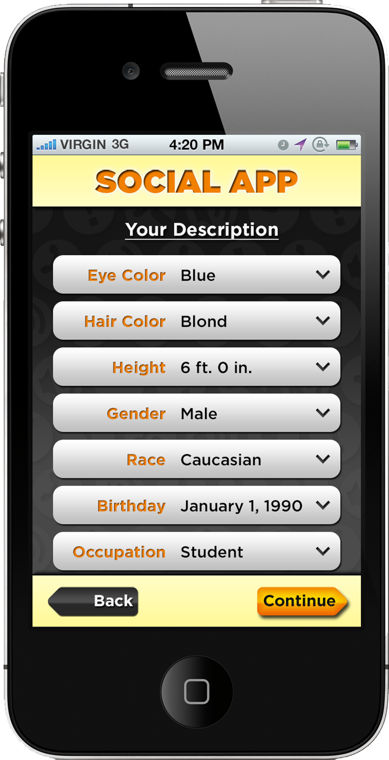 User Description
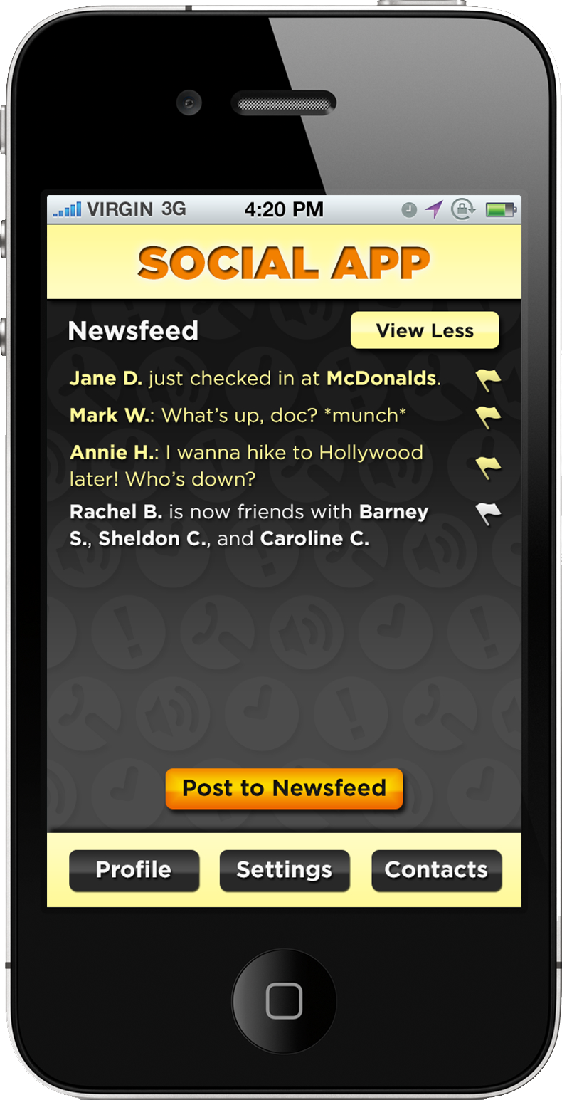 News Feed
The target audience of this social app are teens, and teens respond well to images that pop. To get this vibe, lots of gradients and shadows are used, simulating a 3D effect. The high contrast between the background and the foreground enhances this effect.
Notice that background looks deeper than the top and bottom bars, while the buttons feel closer to the user. Seeing the difference in depth triggers the user to press it.
When looking at either screen, the eye usually focuses on the shiny orange-gold button. Using this style on a screen’s primary action button would help guide the user to the right direction.
Food App Sample
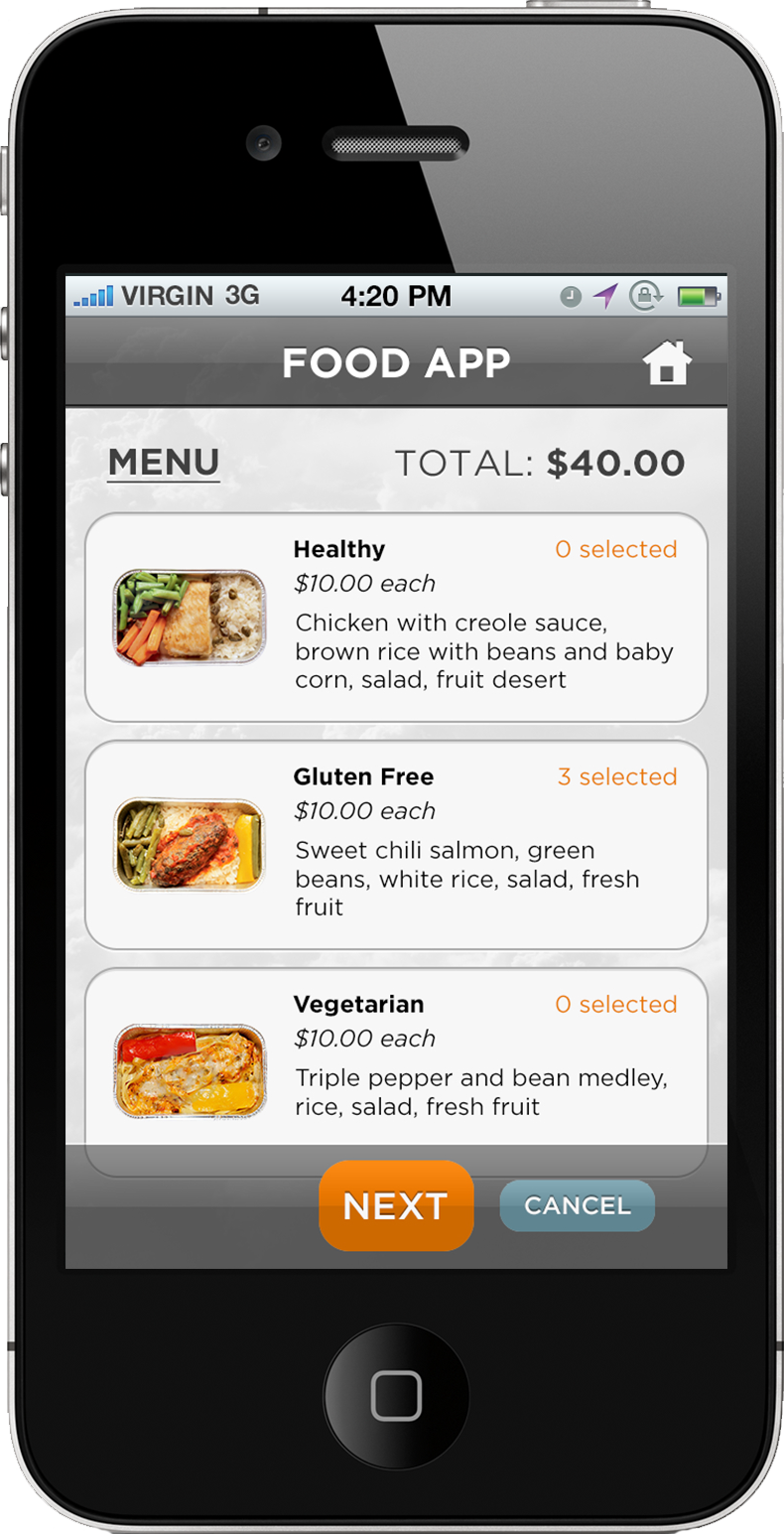 Menu Items
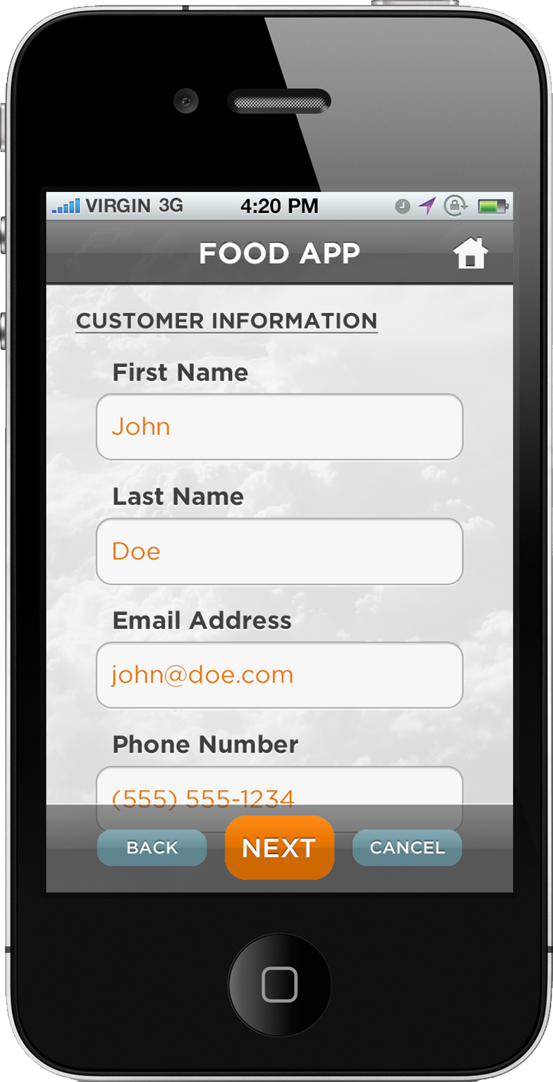 Customer Information
 Confirm Order
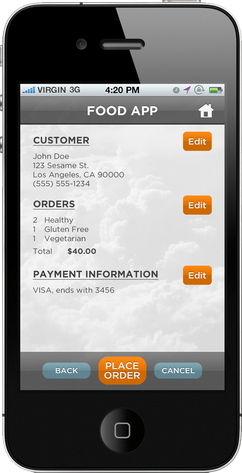
The app’s goal is to satisfy the user’s appetite through food delivery. Orange is a warm color, and warm colors help increases appetite. (Notice that most food establishments use warm colors.) Combining these two enhances the user’s experience.
To emphasize orange buttons, which also denote the primary action buttons, other buttons have the opposite color, which is teal. Another trick is pulling focus away from other elements by using grayscale colors. The button’s placement is another factor. Some apps put their primary action button at the center-bottom of the screen. All three tricks should help the user navigate through the app without any assistance.